

Digital Ready is a program run by the Tasmanian Government to help train local small business owners in online marketing and making use of current technology solutions. As part of an update to the program, a new Q&A-style blog was developed to address common problems and challenges. I was contacted to design a mascot character that would give a welcoming face to this section of the program and fit in well with the established web design and illustration style.
The Brief

The Department of State Growth and their web developer, Takeflight, had already discussed the possibility of having a mascot designed for the Doctor Digital blog. Having seen some of my work previously, they felt my illustration style would make for a good fit with their goals and existing designs. Between them, they had formed some loose aims for the character – they were keen for a friendly female character who was a scientist or professor rather than a medical doctor, able to answer questions with authority, *and* who also happened to be a robot.
When the request came to me, the idea of a "female-academic-doctor-robot" initially struck me as a bit of a tall order, but we got talking and put together some more polished requirements:
- A target audience of small business owners, often older Tasmanians, who are somewhat intimidated by the digital world.
- In terms of personality, the character should appear friendly, approachable, eager to help, confident and professional. One person from the Department suggested thick expressive glasses to resemble the blog's author.
- In terms of appearance, the character should be recognisable as a female academic or scientist, possibly as a robot or with other visual cues linked to technology.
- Due to size constraints, preference is for a simple design with all important features recognisable at a small size.
- The artwork should feature the character's whole body - however as most applications will place the character in a circular frame as a "head shot", the upper body and face are particularly important.
- The artwork should make use a "flat" aesthetic to fit in with existing imagery on the Digital Ready website.
- The artwork should be made for general use, with a smiling "helpful" pose and a curious "thoughtful" pose.
Early work
Shape and silhouette are fundamental considerations in character design. If I'm able to communicate a few key features through these alone, I know I'm on the right track. Occupation is a fairly superficial thing that can be put off until the costume design stage. The real challenge for me was figuring out how to invoke an organic, human quality like femininity with a robotic character.
The easy way out would have been to treat femininity as superficial as well, and just slap on a few bits of jewellery and makeup. I use these things in moderation, but it's very lazy design to lean on them as the only indication that a character is female.

My early sketches were quite blocky and weighed too heavily on the mechanical side; others went the opposite extreme and became too human. Eventually, I settled on a bell-like body with a mix of sharp angles and prominent curves, a wide round bookish face, and a "costume" design that could take on a few different suit or coat appearances depending on colour choices.
Refinement
Settling on the right colours was my next major concern. I based my options on the palette used throughout the Digital Ready website, but the combination took some trial and error to get right.
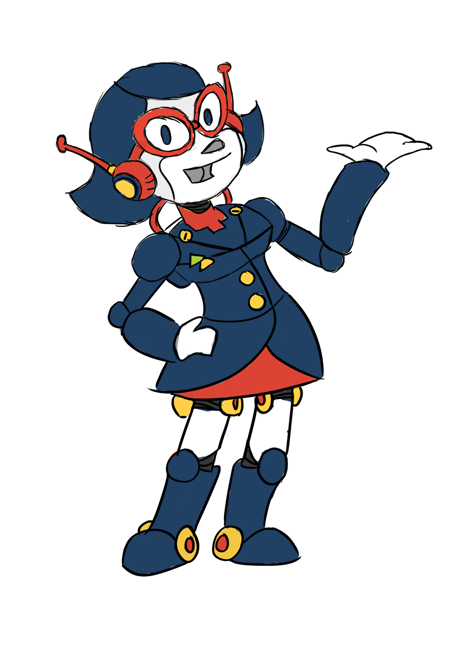
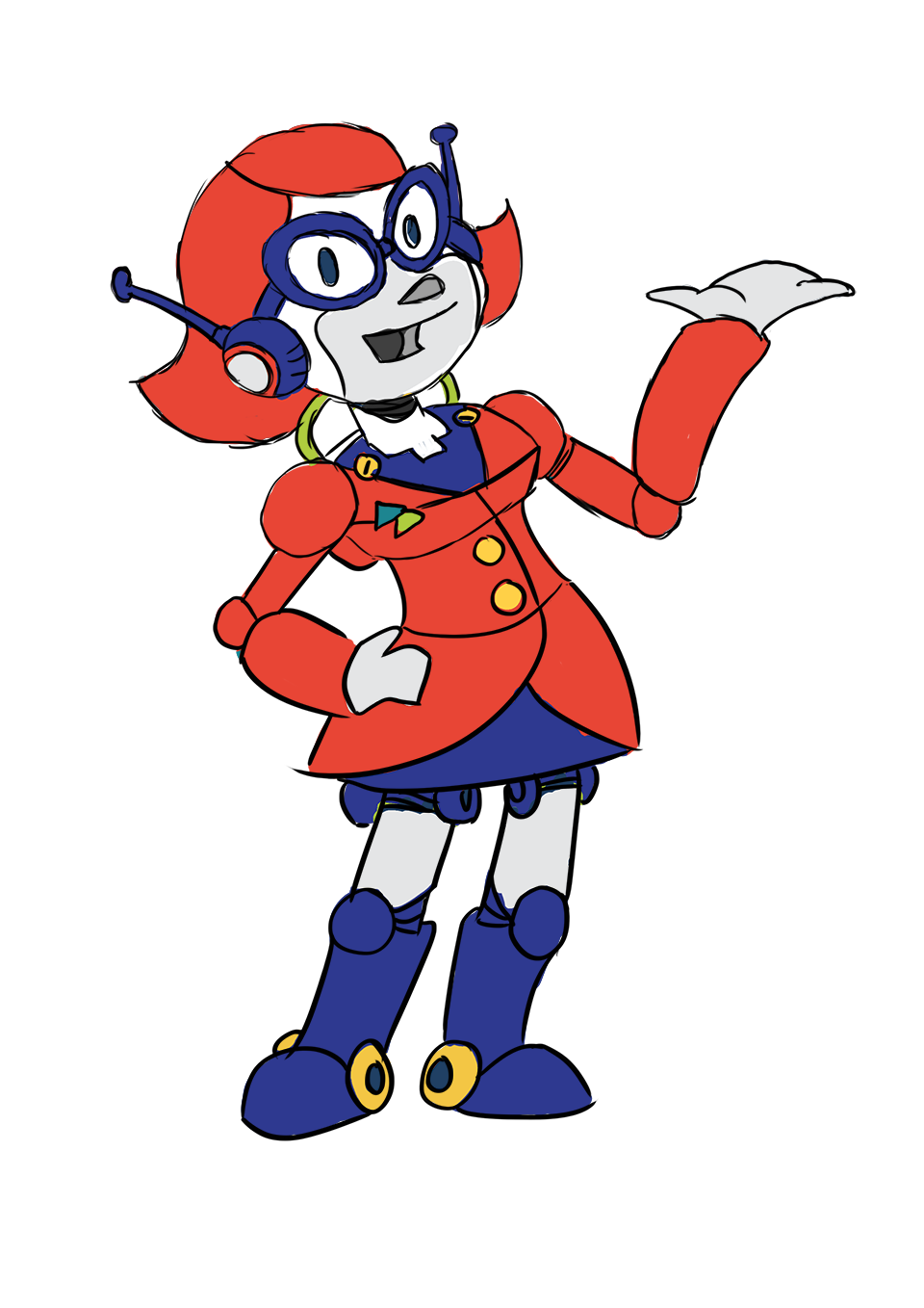
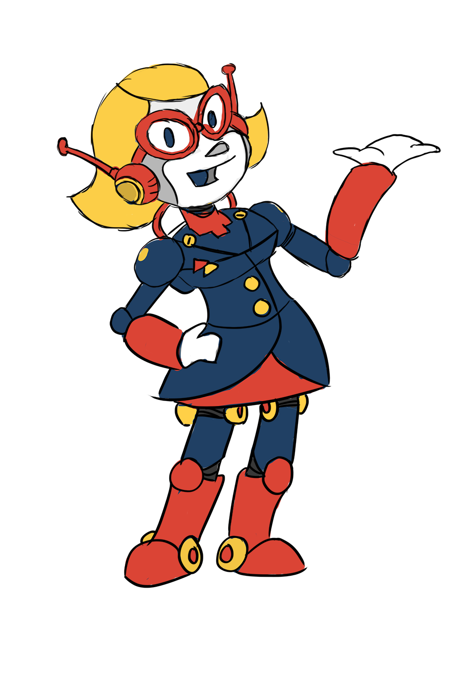
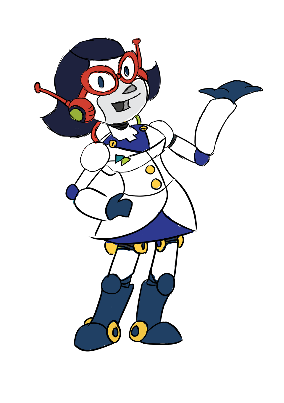
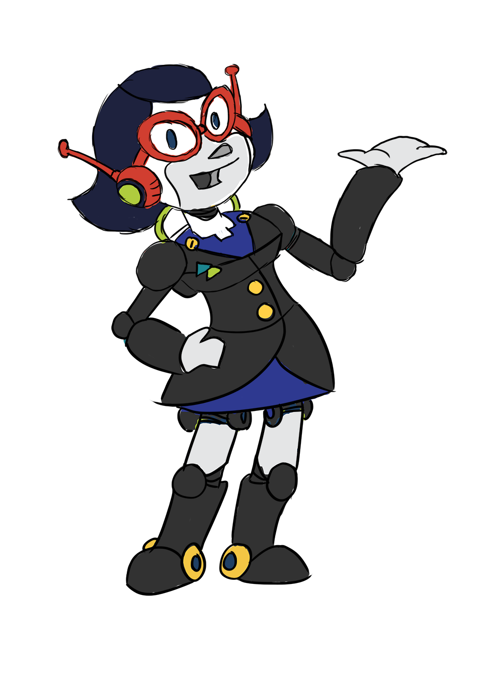
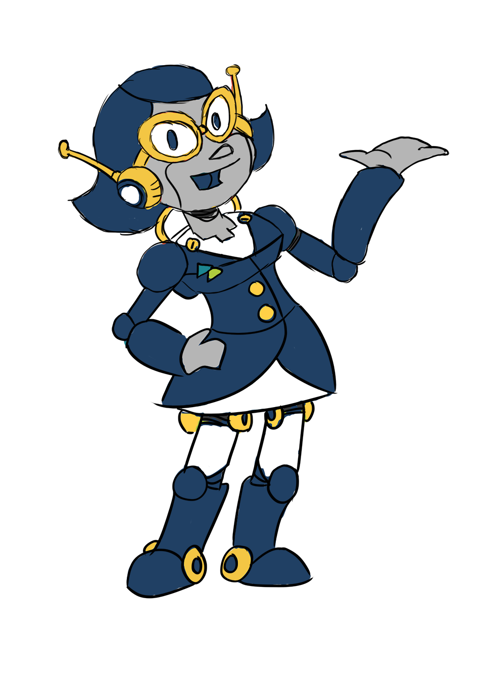
As I kept working with the pose I was using, I came to feel like it was a bit too exuberant, and wouldn't work so well with a flat aesthetic. I went back to sketch a plainer front-on version that I could construct with simpler geometric shapes. This had the added benefit of making it easy to reposition the character's arms and face for different poses.

Things progressed rapidly from here. The right colour combination was much easier to decide with a simplified pose. The coat became a sharp navy blue business suit and defined the primary colour for the whole design. A vibrant teal emerged as the best choice of secondary colour to contrast with the suit and add a little extra personality, leaving silver and white to complete the picture of a friendly robotic businesswoman.
Finished artwork


With all the hard questions out of the way, all that remained was to arrange the fully-assembled Doctor Digital into the necessary poses - one helpful, and one thoughtful. The final exported artwork put her inside a circular frame, ready to plug straight into the web design.

