

One of my earliest logo design projects was for a good friend who was starting up a computer retail and support business. He wanted to appeal to people who use computers every day, but don't understand them very well; the kind of people who are intimidated by technical jargon and panic when something goes wrong with their machines. The business would focus on simplifying buying choices and providing a quick and personable service.
The client brought the project to me with the name, "Bitlink", and the tagline, "domesticating technology". He wanted the brand to emphasise approachability, so a hand-illustrated direction was desired. One idea of his that I really loved was to represent each of his services with a cartoon character. In our early discussions, we spoke about a few sources of stylistic inspiration, including The Jetsons and the indie adventure game Machinarium.
Character designs
Early in the process, I felt that the soul of the brand would be easiest to discover through the character illustrations, so work began on these first. The style I developed emphasised simple and highly gestural shapes, and in designing the characters, I sought to give each a distinctive face and body shape.

The Builder, who stands for custom computer retail, is composed of big blocky shapes, with an emphasis on his upper body, giving him a strong and dependable appearance.

The Fixer, representing technical support, is built on contrasting curves and sharp angles to give her a friendly appearance with an energetic flow.

The Developer, who personifies web design and software development, was imagined as a coffee-fuelled whiz kid. His messy hair, strawberry-shaped face, and catlike mouth give him a zany, creative appearance. Some design features in the sketch were revised to make him look more mature in the finished artwork.
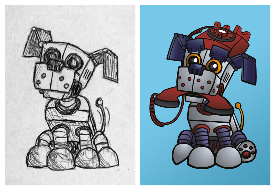
F1 the robot dog, who serves as a mascot, was made to illustrate the tagline "domesticating technology". He shown alternating between mischievous and helpful settings.
Original logo design

The illustrations gave me a solid foundation to begin developing a visual identity and condense the brand's personality into a single mark. In designing the logo, I sought to give each component a distinctive and welcoming feel. The custom lettering achieves this by combining round geometric shapes with the bold personality of slab serifs, while the special angled head serifs add a complementary sharpness and flow.
The enclosing robot mark expands on these forms to give the entire mark a smiling face-like quality. The client had plans to begin marketing with mailout campaigns, so it was important that the colour of the logo reproduced well in print. A warm Pantone blue with good conversion qualities for digital process inks was chosen for this purpose, as well as to balance the fun shapes of the logo with a calm, professional image.
A guiding principle I incorporate into my logo design process is that the mark needs to work well not only in its original colour, but also in plain black, as well as reversed out of a solid background. The Bitlink logo works especially well in this regard, and ended up being used in its reversed-out version in many of its marketing applications.
Brand evolution
As time went on, Bitlink's activities and goals changed significantly from its initial one-stop-shop concept for computer retail and repair. Instead, Bitlink became about software development, cross-disciplinary collaborations, and educational outreach programs. By this time, they had defined a set of core specialisations that separated them from typical development firms:
Novel interaction: projects that involve interacting with sensors in the environment, tangible user interfaces, augmented reality and virtual reality.
Social good: projects that have a health, environment or education component to them.
Creativity: projects that include rich illustrations, voice acting, storytelling, video, animation, 3D modelling or gameplay.
Research outcomes: projects that contribute to human knowledge in a meaningful way.

The concept of a friendly, welcoming robot and the broad intention behind the original logo is still very relevant to Bitlink's new goals, so the new version retains the fundamental idea, tidies up the execution, and brings the finishing touches up to date.

The things I’d especially like to point out:
- Greater level of refinement in letter forms. Measurements and relationships are much more exact, and incorporate some of the finer points I’ve picked up over time about typographic anatomy. It may not all be visible to the untrained eye, but the grid gives an indication of the rules I’ve set.
- Relationships set by the grid, especially the breathing room to be set aside in situ, which is based on the x-height (one-storey letters) and ascender height (two-storey letters).
- The greater relative stroke width, which will enhance legibility at small sizes.
- The bright blue has no red / magenta in its RGB / CMYK composition. It is based off a pure cyan, and there are a fair few things we can say for the colour theory. Being a kind of sky blue, it suggests ambition and freedom. We could also call it an electric blue, so it has plenty of energy without appearing garish. Shifting a little toward the greener end of blue also gives it a hint of the associations with creativity and growth. It fits well with the current design trend toward pure, bright, happy colours, and gives Bitlink a clean, peppy image as a creative company.
Here's what the client had to say when this was presented:
“Super, super, super happy with the refresh. Feels like this robot guy is just full to bursting with awesome and can’t wait to tell you all about it. Think you’ve made some fantastic decisions in here to bring the brand up to date with the new company direction, and all from a firm foundation of our branding roots. Beautiful stuff.”

