

Definium is an advanced manufacturer of specialist technology solutions. They design, produce, and program Linux-based embedded systems for purpose-specific industrial applications.
The founder, Mike Cruse, is a passionate craftsman. He was looking for an appealing mark to sign his work with that expressed his values and vision for his business. His career has taken him all over the world and he has built Definium over several decades. The company has very much become his life's work, so discovering the essence of its new visual identity presented an exciting challenge.

The original Definium logo, which Mike had been using beforehand. Mike was keen to retain a technical reference and utilise an aesthetic of mathematical elegance, which had been his intention with the sine wave graphic here.
Project goals
Mike and I discussed his needs over a series of lengthy in-person meetings. As we spoke, a few key goals took shape.
Design constraints
Special applications: One special usage case for the logo would be screen-printed onto Mike's custom-made circuit boards. Space is at a premium and the engineering takes priority. Therefore, it was critical that the design work well at small sizes and have variations to suit multiple aspect ratios.
Colours: For some time, Mike has had his circuit boards produced with a white finish on the substrate. Alongside the gold circuit tracks and mostly black components, this created a distinctive utilitarian aesthetic that we felt was worth emphasising in the visual identity.
Expandability: Though Mike had run Definium on his own up to this point, he was preparing to hire a team and expand the scope and capabilities of the company. Part of his long-term plan was to develop product lines that would need their own branding in line with the larger visual identity. As a result, consideration would need to be given to laying the foundation for an expandable visual vocabulary.

Some of Mike's products in the later stages of assembly.
Target audience
In speaking about how Mike goes about seeking new business and the relationship he has with his customers, we identified three main groups of people to reach:
Technical people within organisations and academics. Definium often collaborates with other technology companies and universities, and a significant portion of its business comes from contract manufacturing. The impression that contacts within these organisations have of Definium should be one of trustworthiness and professionalism.
Politicians and public officials. These people would be responsible for evaluating grant applications. This would make it important for Definium's identity to be politically neutral.
End users. This group would include the people on the ground who actually use Definium's products, such as farmers, technicians, and industrial workers. They should associate Definium products with durability, reliability, and quality craftsmanship.
Brand essence
Central concept: Mike told me that he invented the name "Definium" from the Latin word "definire", meaning to resolve, or set bounds to – it gives us the modern English word "define". To Mike, the name was a reference to his engineering process, which often involves immersing himself in a complicated set of problems, gradually making sense of things, and methodically piecing together a functional solution. The central concept behind Definium, then, was "order out of chaos".
Research directions: As an engineer, Mike is passionate about science and has a strong appreciation for symmetry, mathematical precision, and elegance in nature. He also nurtures a side hobby of collecting and restoring vintage computers. These offered ample opportunities for gathering inspiration.
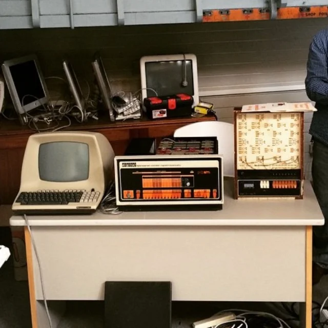
Mike collects and restores vintage computers. These are a few of his favourites from the dawn of the information age.
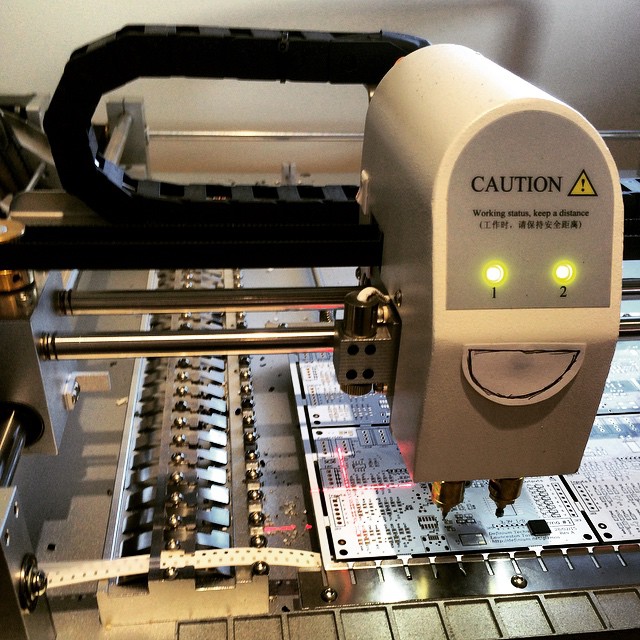
One of Mike's pick-and-place robots used in the manufacturing process. He has affectionately nicknamed this one "Blinky".
Searching for a concept
Visual research And early sketches
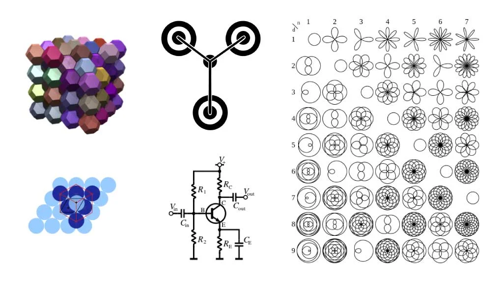
I began my search for inspiration with a basic list of topics that were relevant to science and engineering, and could potentially tie back to the concept of order out of chaos:
- Crystal structure and molecular diagrams
- Impossible geometry, extradimensional shapes, and fractals
- Magical marks, futurism, and science fiction
- Vintage computers and the history of electronics
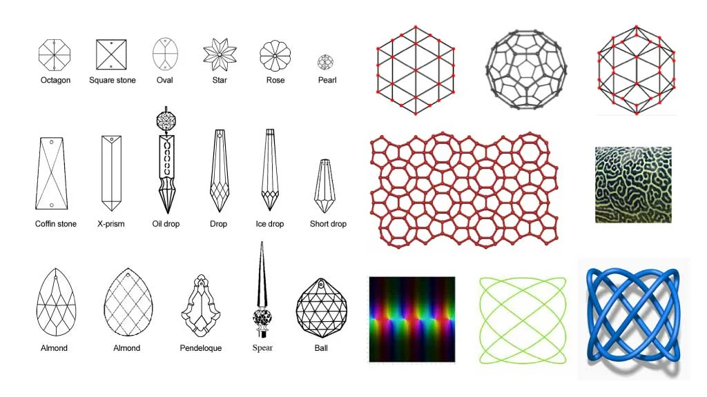
I paid particular attention to the aesthetics of circuit boards and the symbols used in circuit diagrams. What I found was an abundance of thin parallel lines, angles constrained to 45° increments, rounded corners, circular holes, and a sense of neat precision mixed with a kind of organic complexity.


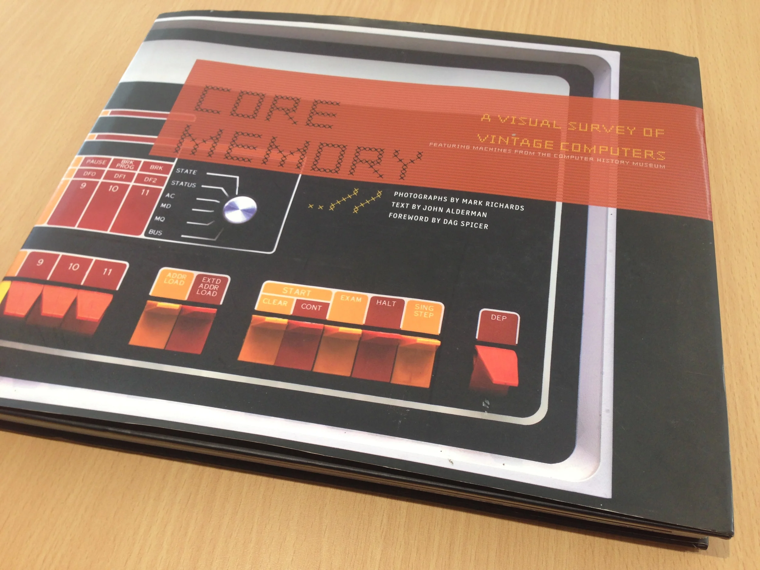
One of the most interesting reference materials I looked at was a book from Mike's collection that was a photographic survey of vintage computers. This was very useful in studying the visual language used in the field of electronics and the historical context I was working within.
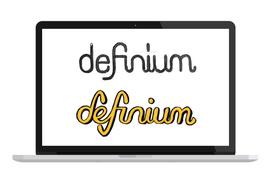
I gave this information time to settle, and kept it in the back of my mind as I worked on other projects. Occasionally, ideas would emerge as I was sketching something else entirely. Some of these early concepts considered stylising the taller letters D and F into a logomark. One that stuck out was the idea of linking the "inium" letters in a single wave-like stroke.

As I looked further into the list of research topics, I learned about lissajous curves and lissajous knots – figures that graph the relationship between overlapping waveforms. As mathematically-defined figures, they can become quite complex and beautiful while retaining a sense of precise symmetry.

"Lissajous animation" by Krishnavedala - Own work. Licensed under CC BY-SA 3.0 via Wikimedia Commons.
I found them visually interesting and highly relevant to the central concept of "order out of chaos", but without an understanding of the mathematics involved, I had difficulty studying them. It was at this point that I returned to Mike and asked if he could give me a demonstration with some of his equipment. He enthusiastically agreed, and we spent several hours in his lab generating shapes on an oscilloscope, tweaking the variables here and there to see what would happen.


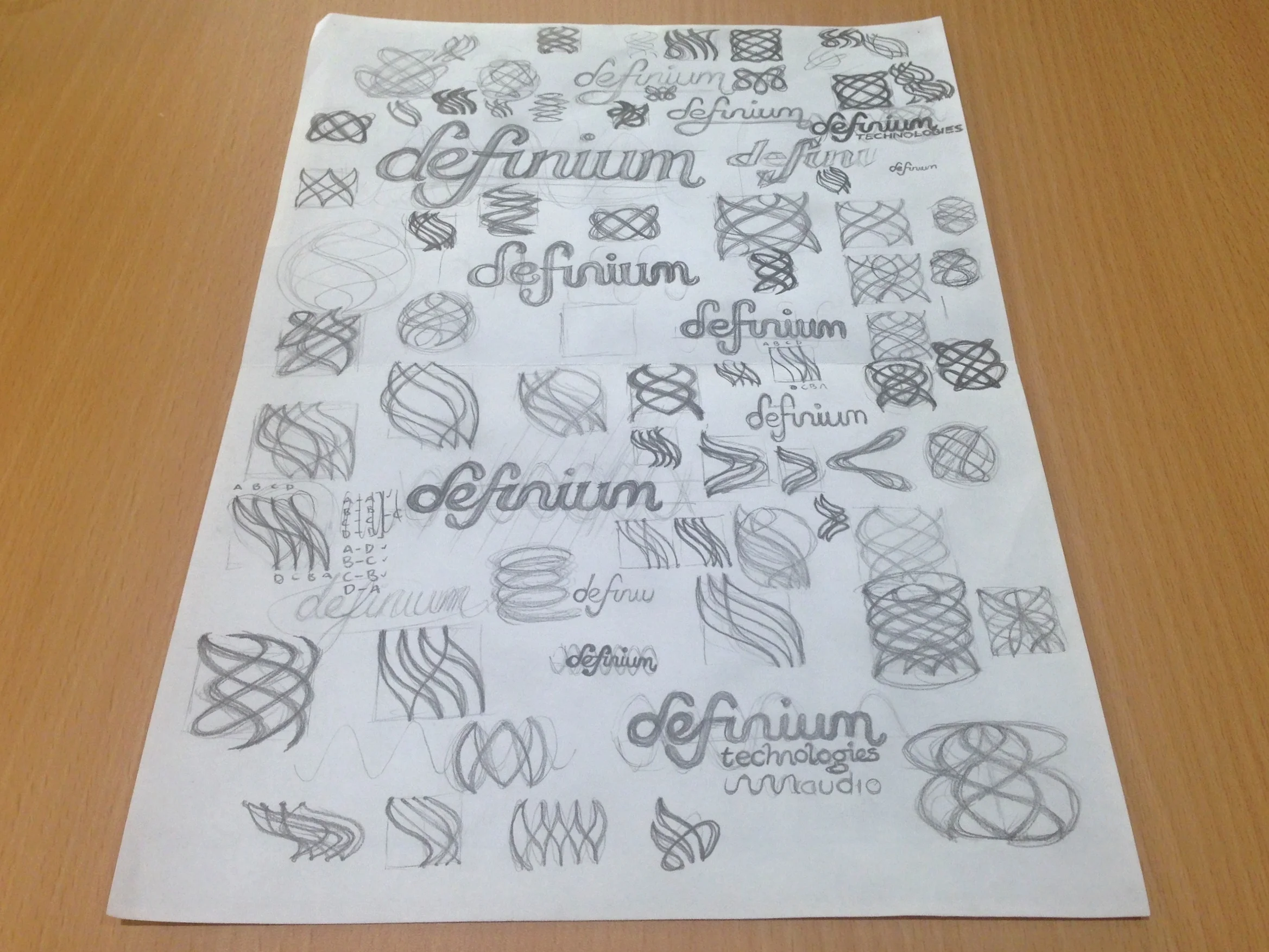
I began experimenting with lissajous shapes in my sketches, and continued to try different approaches to the wave-inspired lettering. While the more symmetrical knots had the cleanliness and technical look I was after, they came across as somewhat bland. The less symmetrical ones were more energetic, but lacked the sense of neatness that would communicate reliability. The balance of order and chaos wasn't quite right.
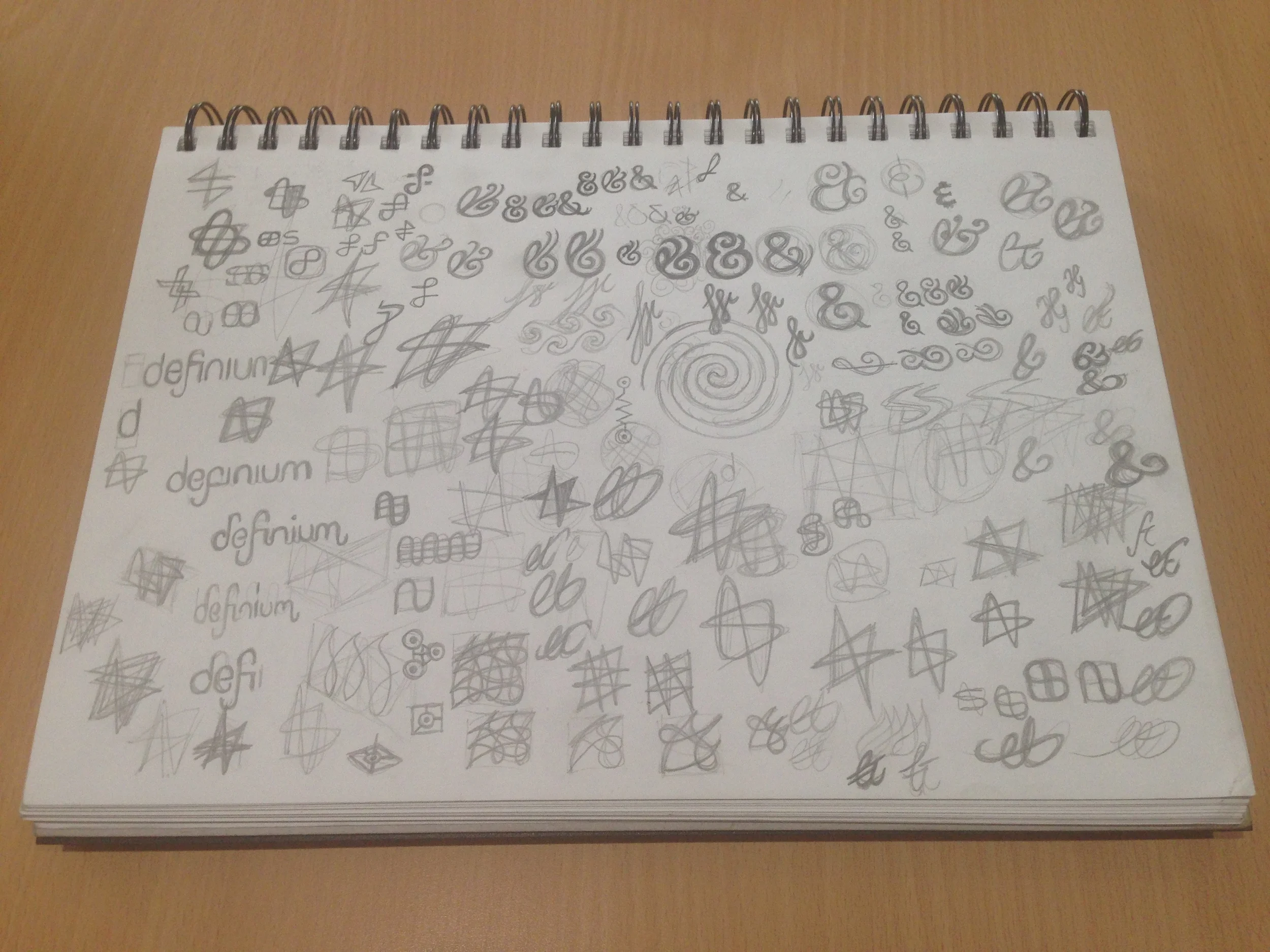
I decided to minimise the complexity of the lissajous form and limit the number of intersections I was working with. I began to make more sense of how the knots were formed in a single continuous stroke. Drawing a wave horizontally, then switching the direction by 90 degrees and linking back to the origin point resulted in something resembling one of the simpler and more common lissajous knots. I discovered that it could also work as a star-like shape with sharper angles, or as arrowheads pointing opposite directions.
The wave-like lettering continued to develop at the same time, and I experimented with different height-to-width ratios in the letterforms. As I iterated further, I concluded that the letter F needed to be an ascender variety, so it would not be the only letter taking up space below the baseline and adding needlessly to the footprint of the logotype. I also discovered an opportunity to link the F and I together as a ligature, which would help to maintain balanced spacing so long as it did not compromise legibility.
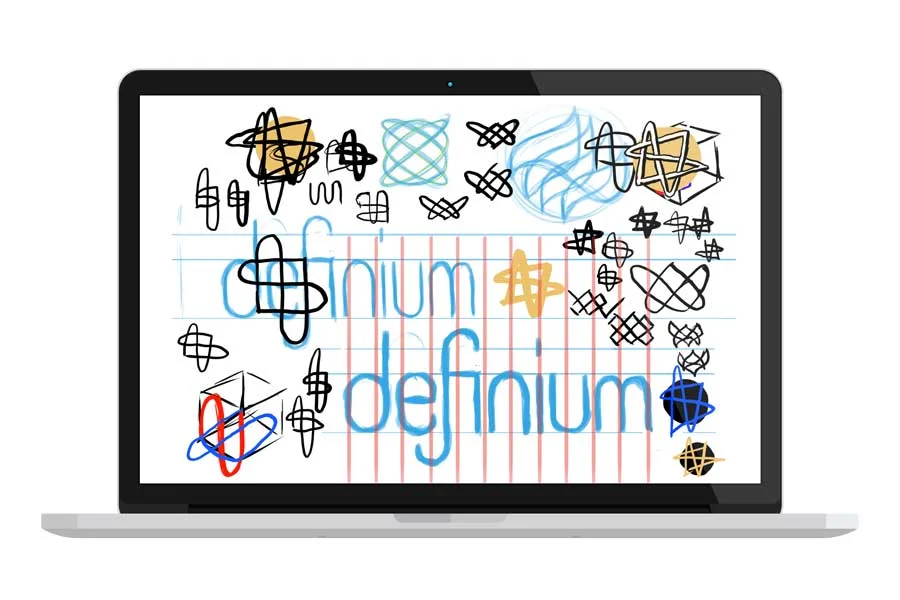
While I prefer sketching on plain paper for rough work, drawing digitally has the advantage of giving me tools to quickly and accurately compare spatial relationships, experiment with colour, draw over earlier work, and easily splice together bits that work well.
It was now clear that the slanted concept was the weaker of the two directions I was pursuing. The D and the F were the only letters that could indicate the sine wave structure, resulting in a mismatched look throughout the word. The concept that I proceeded with had much more internal consistency, suggested a wave structure in a more symbolic and easily-recognised way, and carried a feel of machined precision in its even curves and spacing.
By now, the concept had developed to the point where I could start preparing the vectorised artwork.
Developing the final concept
Logotype vectors
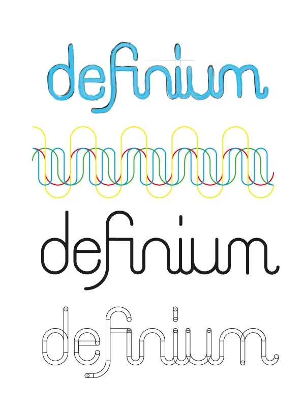
Geometric precision was important for this concept, so I constructed each letter out of perfectly round arcs and straight lines. The exact curves were reused between letters. The F and the M required special treatment, as some of their curves were smaller or longer to balance their sizes relative to the other letters. Ruling a guiding grid helped to define the spatial relationships further.

Linking the "inium" letters in a single stroke as I had in my sketches ultimately compromised legibility, particularly at small sizes. The "fi" ligature did not present the same problem, and in fact served to balance the shape and spacing of the F while also emphasising the wave motif.
Constructing the logomark
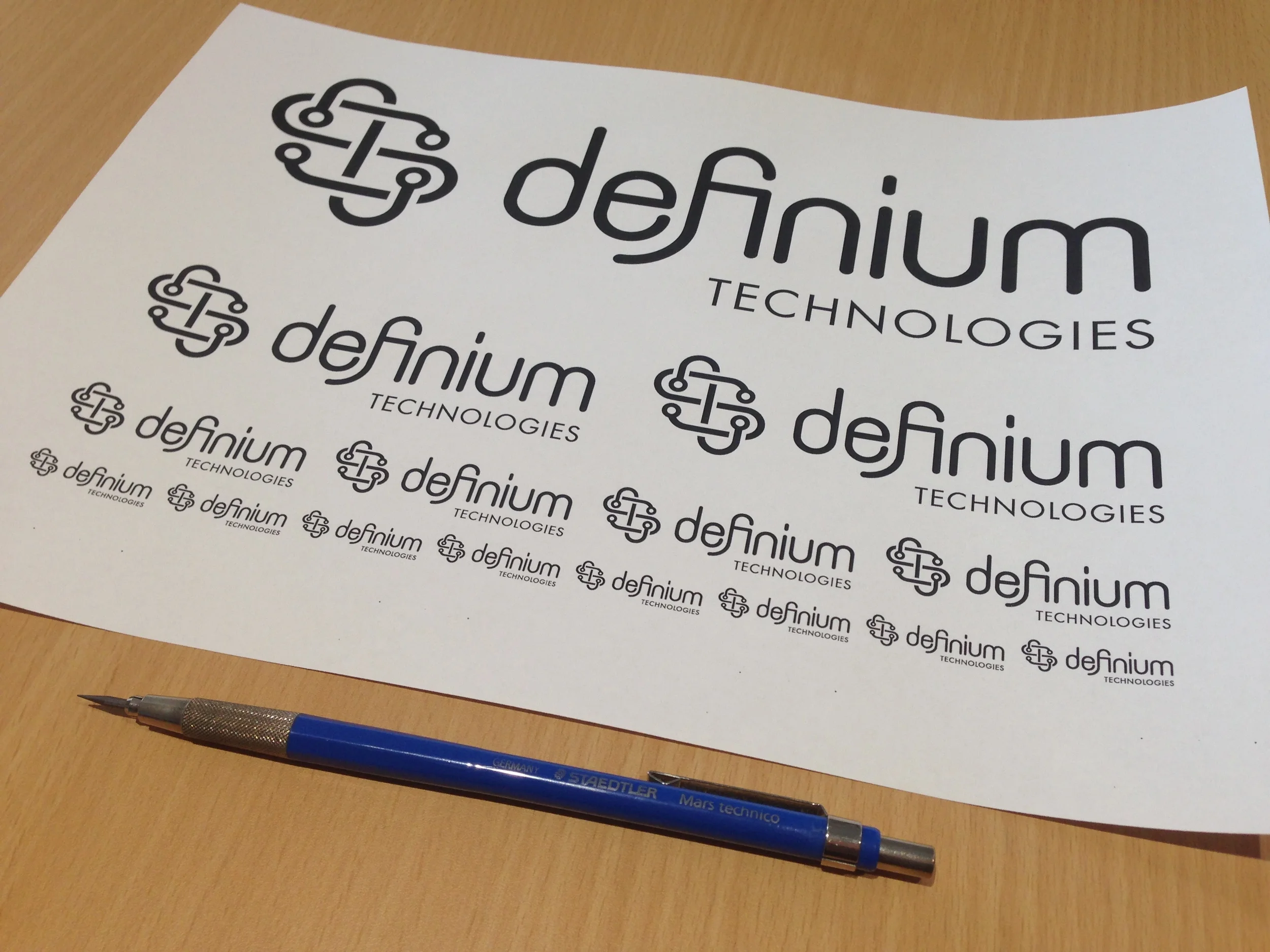
With the lettering close to being finished, I got to work on creating a matching mark. I intended for this to function as a craftsman's signature, usable either on its own or in conjunction with the word mark. It would have the flexibility to be either the centre of attention or a recessive graphic device, depending on the application. I used the same shapes as the letters to begin comparing some ideas, eventually deciding that a square composition was the most flexible.

I chose to emphasise the knot resemblance by threading the stroke in an over-under pattern. On a conceptual level, this drew additional connections to the central idea of "order out of chaos" through a neatly repeating pattern within a complex shape. It could also be seen as a reference to the Gordian Knot – an impossible problem that can only be solved by thinking outside the box.
While this was getting close to the mark, the connection to electronics was not yet as clear as it needed to be. The addition of circular "vias" – the through-hole paths connecting separate layers on printed circuit boards – reinforced this association.

Extra details and testing for legibility
The word "technologies" needed to be added below the Definium word mark, and the space at the bottom right balanced well with the slight descender in the letter F. I chose the typeface Futura, as its geometric forms and near-even stroke weight fit well with the style of the word mark, it has a history of association with scientific and technological fields, and it is one of a few typefaces that has stood the test of time especially well.
At this point, I printed out the finished composition to check how well it would appear at various sizes, particularly in reduction. The very smallest sizes I checked were comparable to what would be achievable when screen printed onto circuit boards, and remained clearly legible.
After close inspection, I also decided to round out the sharp angles in the Futura font to further strengthen its cohesion with the shapes of the word mark.
Choosing Brand colours
With the logo's composition finalised, I began trying out different colour combinations on both light and dark backgrounds. The black, white, and gold of Mike's products carries a premium and utilitarian feel, which informed the ideas I experimented with.

I eventually chose a bright gold and a dark purple as the primary brand colours. These two are at opposite ends of the colour wheel, so they contrast and complement each other well. They also carry associations in line with the project goals:
Yellow/gold: Visibility, brilliance, industry and utility. Leaps forward and draws attention.
Purple: Mystery, magic, outer space and the night sky. Quiet but distinctive, making it useful as a special background colour.
I rounded out this colour palette with darker and lighter variations, as well as a secondary palette of cool receding greys that would make good choices as backgrounds or subtle embellishments.

Results
The finished concept is a logo that evokes machined precision. Its guiding wave-like structure, geometric forms, and lissajous-inspired mark make use of the visual language of electronics to symbolise the key aspects of Definium's work to both technical and non-technical audiences alike.
On a conceptual level, the wave motif represents "order out of chaos" as a "signal in the noise", and the lissajous knot can be seen to symbolise an elegant solution to a complicated problem.
With its measured spatial relationships, clean edges, and internal consistency, it suggests trustworthiness, reliability, and quality craftsmanship. These qualities also make a solid foundation for building an accompanying illustration style and matching design treatments for branding collateral.
It remains clearly readable at all sizes, and the iconic mark may be used separately to the word mark to suit multiple applications.


